It's a wonderful new logo.
Refreshing our Brand for the Next 50 Years of Transformation
As Shelburne Farms celebrates half a century of work with educators, students, and learners of all ages, we’re refreshing our brand and renewing our commitment to inspire and cultivate learning for a sustainable future.
Fifty years ago, the education nonprofit “Shelburne Farms Resources” started with the seed of an idea: that through education and learning, we could make a better world, one that is more healthy, just, and sustainable for all. As well-tended seeds do, the idea blossomed and grew into something unimagined back in 1972. Shelburne Farms has become an education nonprofit with a global reach, sharing lessons learned here on our working farm campus, and welcoming all to explore and advance the ideas of sustainability. We’ve restored and adapted the buildings on the historic agricultural estate and nurtured our soils and pastures to craft valued farm products.
Purpose Grounded in Place
As we’ve grown, people have come to know Shelburne Farms in many different ways: as a nonprofit for advancing learning and as a place of unparalleled beauty. Those two identities have long existed side by side, but they’re deeply entwined. As we celebrate the first 50 years and get ready for the next, our brand refresh will help unite these two aspects of our identity. We’re inviting people who love the place to engage more deeply with our educational purpose — and we’re helping people who know our purpose to see all places, and not just the farm, as canvases where learning can unfold.
Transformation: It’s in the Air at Shelburne Farms (And the Soil, and the Water)
As our team worked on the brand refresh, we reached out to people across our community to ask: What does the Shelburne Farms brand mean to you? The responses reflected the many ideas, memories, and experiences people have of Shelburne Farms but one theme ran through much of what we heard: people kept telling us about transformation.
We heard how transformation is embedded in every “aha” moment we create for learners, and in the ideas that are sparked when we bring educators together. It’s as simple as feeling rejuvenated after a walk on the farm trails, and as complex as the chemistry that comes together to make our cheddar. We see transformation in nature’s seasonal changes, and in the evolution and renovation of our historic campus. And perhaps most urgently, transformation is necessary if we are to create a sustainable future together.
For us, the central theme of transformation is much less about saying the word and much more about exploring its promise so we can deliver transformative learning experiences that inspire changemakers of all ages to build a more sustainable future.
A Fresh Look for Our Brand
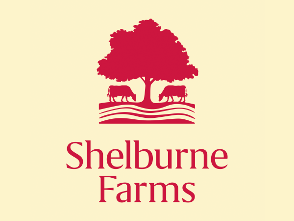
With our refresh, we’re rolling out a new logo that helps stitch together our purpose and place. The previous logo was developed to brand milk cartons in the late 1970s, when Shelburne Farms was selling raw milk from our Brown Swiss cows. Iconic and loved by many, that logo included elements that no longer reflect our current farming practices. Close observers may have spotted rows of corn and bundles of barley in the illustration — dairy feed crops we’ve since abandoned in favor of a more regenerative, pasture-based dairy.
The “new” logo still honors the iconic maple tree, which evokes growth, learning, and the passing of seasons, plus our beloved Brown Swiss cows, now shown grazing to represent our more sustainable, grass-based dairy. The simplified lines also speak to rolling pastures and healthy soil systems, and evoke the founding educational idea of the nonprofit. Accompanying our logo and wordmark are a new suite of fonts and colors. We’ve lightened and brightened our palette to help capture the power of inspirational learning, but our primary color still hews closely to our recognized red. Similarly, new typefaces were selected to be accessible, friendly, and inclusive.
Here’s to the Next 50
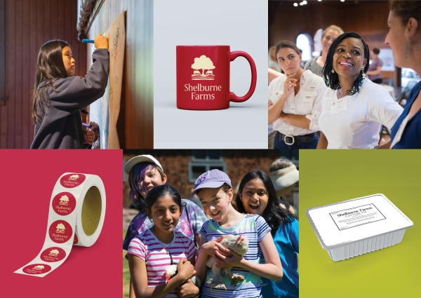
As we celebrate our 50th year, you’ll begin to see some of our refreshed story and design ripple out throughout our printed materials, social media channels, signs, and website. The changes won’t happen instantly, or all at once, but methodically over time. During the transition, you may well see the old and new side by side. We invite you to keep an eye out for the new designs as they make their way across our campus and on our products out in the world.
We hope you’ll embrace the energy and spirit of this thoughtful brand refresh, and feel as excited for the next 50 years of Shelburne Farms as we are. More than ever, we’re inspired by the transformative power of place-based education that is grounded in community and enriched by nature. And we’re so grateful to you for being on this journey with us.
We are deeply grateful to local brand strategist Joseph Ingram for brilliantly, skillfully, and generously collaborating with us to refresh the brand. We are also grateful to the talents of design studio Methodikal for developing the look of the brand.
We would like to acknowledge and thank three artists who contributed to the early look of Shelburne Farms' brand. Mary Azarian created our first logo after the nonprofit was formed in 1972: a woodcut image of a sunflower, which reflected the organization's commitment to farm and nature-based learning. In the late 1970s, Lynda McIntyre and Joe Phelan developed the logo that appeared on Shelburne Farms’ cartons of raw milk, an early agricultural enterprise. After the gift of property to the nonprofit in 1984, that graphic was adapted to become the nonprofit’s logo.


